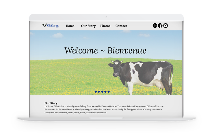
The logo design for La Ferme Gillette Inc was created for a pitch to a local dairy farm. The entire branding package was created for a school project.
After gathering research, the company was looking for a professional logo that would show the friendliness they have to offer. Keeping in mind that they are a dairy farm was very important. With this information, when thinking of dairy, cows and milk are the first things that came to mind. Many sketches were created using cows until the appropriate one was formed.


The final symbol chosen was of a cow. Only using it’s key characteristics make it unique yet identifiable. The symbol gives the company the friendliness they are looking for while the text creates contrast and professionalism.


